Presentation Metrics
|
See it in the scaffold: |
Overview
SUSE® Observability provides already many metric charts by default on most types of components that represent Kubernetes resources. Extra metric charts can be added to any set of components whenever needed. When adding metrics to components there are two options:
-
The metrics are already collected by SUSE® Observability but aren’t visualized on a component, by default
-
The metrics aren’t yet collected by SUSE® Observability at all and therefore aren’t available yet
For option 1, the steps below will instruct you on how to create a metric which will configure SUSE® Observability to add a specific metric to a specific set of components.
For option 2, ensure the metrics are available in SUSE® Observability by sending them to SUSE® Observability using the Prometheus remote write protocol. Continue by adding charts for the metrics to the components ONLY after ensuring the metrics are available.
Creating a metric
For example, the steps will add a metric binding for the Replica counts of Kubernetes deployments. This metric binding already exists in SUSE® Observability, by default.
Create an outline of the metric binding
Open the presentation YAML file in your favorite code editor to change it throughout this guide. You can use sts stackpack test-deploy to test the StackPack, as described in Test deploy the StackPack.
presentation:
  metricPerspective:
    tabs:
      - tabId: node
        title: Node
        order: 100
        sections:
          - sectionId: memory
            title: Memory
            order: 100
            metrics:
              - metricId: node-memory-bytes-available-scheduling
                order: 100
  metrics:
    - metricId: node-memory-bytes-available-scheduling
      name: Memory available for scheduling (Custom)
      metricQueries:
      - alias: ${cluster_name} - ${node}
        expression: max_over_time(kubernetes_state_node_memory_allocatable{cluster_name="${tags['cluster-name']}", node="${name}"}[${__interval}])
      chart:
        _type: TimeSeriesChart
        unit: bytes(IEC)
In the above setting, the metric is shown in the metrics perspective; alternative locations are shown below. The metricQueries section will be filled in the next steps.
|
The unit used is |
Write the PromQL query
Go to the metric explorer of your SUSE® Observability instance, http://your-instance/#/metrics, and use it to query for the metric of interest. The explorer has auto-completion for metrics, labels, label values but also PromQL functions, and operators to help you out. Start with a short time range of, for example, an hour to get the best results.
For the total number of replicas, use the kubernetes_state_deployment_replicas metric. To show the metrics charts of the time series data, extend the query to do an aggregation using the ${__interval} parameter:
max_over_time(kubernetes_state_deployment_replicas[${__interval}])In this specific case, use max_over_time to make sure the chart always shows the highest number of replicas at any given time. For longer time ranges, a short dip in replicas are not shown. To emphasize the lowest number of replicas, use min_over_time instead.
Copy the query into the expression property of the first entry in the queries field of the metric binding. Use Total replicas as an alias. for it to show up in the chart legend.
|
In SUSE® Observability, the size of the metric chart automatically determines the granularity of the metric shown in the chart. PromQL queries can adjusted to make optimal use of this behavior to get a representative chart for the metric. Writing PromQL for charts explains this in detail. |
Bind the correct time series to each component
The metric with all fields filled in:
metricId: my-deployment-replica-counts
name: Replica counts
metricQueries:
  - expression: max_over_time(kubernetes_state_deployment_replicas[${__interval}])
    alias: Total replicas
chart:
  _type: TimeSeriesChart
  unit: short
Creating it in SUSE® Observability and viewing the "Replica count" chart on a deployment component gives an unexpected result. The chart shows the replica counts for all deployments. Logically one would expect only one time series: the replica count for this specific deployment.
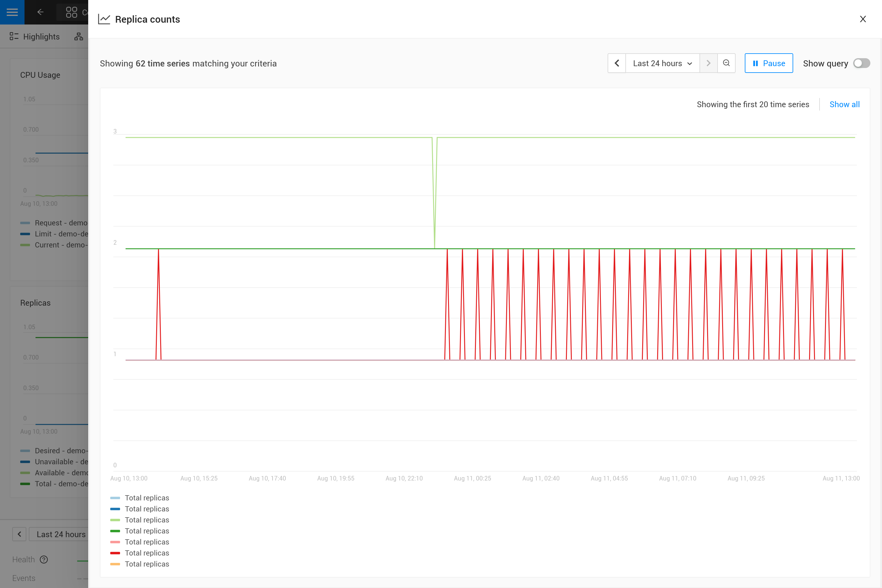
To fix this make the PromQL query specific for a component using information from the component. Filter on enough metric labels to select only the specific time series for the component. This is the "binding" of the correct time series to the component. For anyone experienced in making Grafana dashboards this is similar to a dashboard with parameters that are used in queries on the dashboard. Let’s change the query in the metric to this:
max_over_time(kubernetes_state_deployment_replicas{cluster_name="${tags['cluster-name']}", namespace="${tags['namespace']}", deployment="${name}"}[${__interval}])
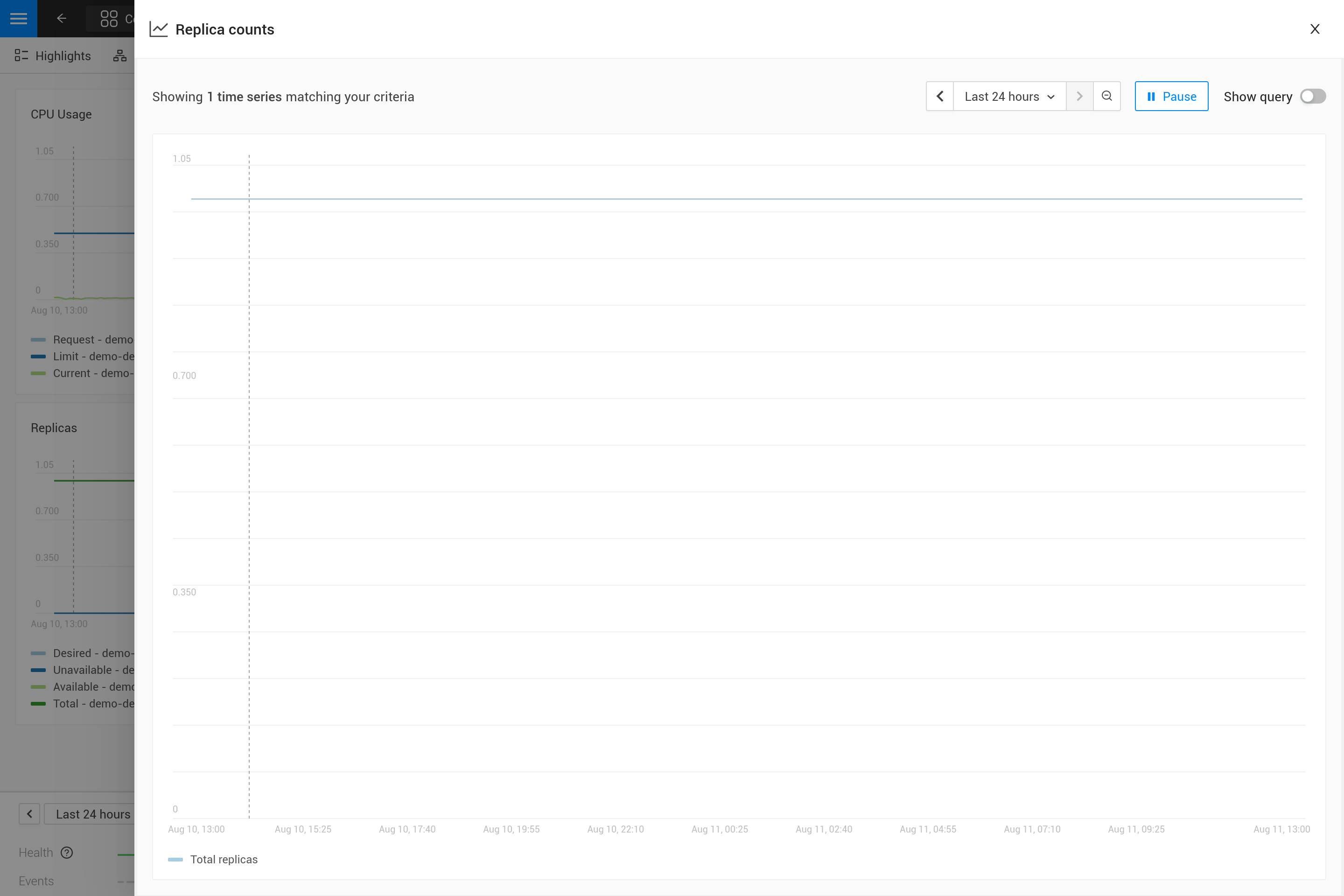
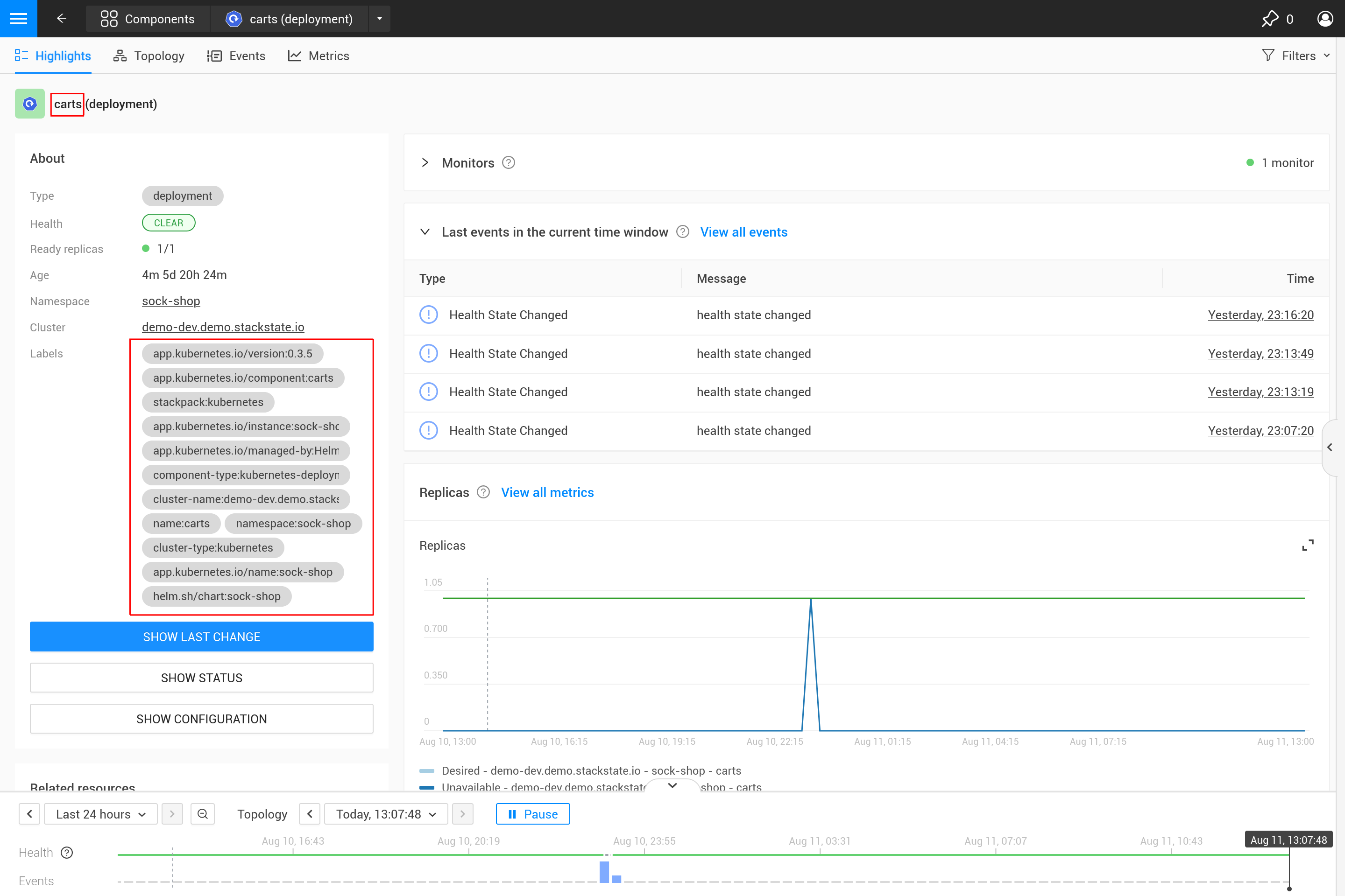
The PromQL query now filters on three labels, cluster_name, namespace and deployment. Instead of specifying an actual value for these labels a variable reference to fields of the component is used. In this case the labels cluster-name and namespace are used, referenced using $\{tags['cluster-name']} and $\{tags['namespace']}. Further the component name is referenced with ${name}. The complete CEL Context gives access to a number of other fields as well.
|
The cluster name, namespace and a combination of the component type and name are usually enough for selecting the metrics for a specific component from Kubernetes. These labels, or similar labels, are usually available on most metrics and components. |
Attach the metric to a UI location
With the metric defined, it must be bound to a location in the UI (or multiple). There are three options available
-
Component Summary - the right-hand-side panel and popups in the topology perspective
-
Component Highlight - the highlight page of a component
-
Metrics Perspective - in one of the tabs and sections of the metric perspective on the component
It is possible to re-use a metric that was defined on a more generic presentation for a component, partially overriding it by specifying the modified fields. When binding a metric to a UI location, you must define an order field to determine its position relative to its siblings.
Merging
More specific presentations can override fields of metrics inherited from more generic presentations. Metrics bound to a UI location also inherit the fields that were set at the same location for the same metric in a generic presentation.
Advanced
More than one time series in a chart
|
There is only one unit for a metric (it gets plotted on the y-axis of the chart). As a result you should only combine queries that produce time series with the same unit in one metric. Sometimes it might be possible to convert the unit. For example, CPU usage might be reported in milli-cores or cores, milli-cores can be converted to cores by multiplying by 1000 like this |
There are two ways to get more than one time series in a single metric and therefore in a single chart:
-
Write a PromQL query that returns multiple time series for a single component
-
Add more PromQL queries to the metric
For the first option an example is given in the next section. The second option can be useful for comparing related metrics. Some typical use-cases:
-
Comparing total replicas vs desired and available
-
Resource usage: limits, requests and usage in a single chart
To add more queries to a metric simply repeat steps 3. and 4. and add the query as an extra entry in the list of queries. For the deployment replica counts there are several related metrics that can be included in the same chart:
- metricId: my-deployment-replica-counts
  name: Replica counts
  metricQueries:
    - expression: max_over_time(kubernetes_state_deployment_replicas{cluster_name="${tags.cluster-name}", namespace="${tags.namespace}", deployment="${name}"}[${__interval}])
      alias: Total replicas
    - expression: max_over_time(kubernetes_state_deployment_replicas_available{cluster_name="${tags.cluster-name}", namespace="${tags.namespace}",  deployment="${name}"}[${__interval}])
      alias: Available - ${cluster_name} - ${namespace} - ${deployment}
    - expression: max_over_time(kubernetes_state_deployment_replicas_unavailable{cluster_name="${tags.cluster-name}", namespace="${tags.namespace}",  deployment="${name}"}[${__interval}])
      alias: Unavailable - ${cluster_name} - ${namespace} - ${deployment}
    - expression: min_over_time(kubernetes_state_deployment_replicas_desired{cluster_name="${tags.cluster-name}", namespace="${tags.namespace}",  deployment="${name}"}[${__interval}])
      alias: Desired - ${cluster_name} - ${namespace} - ${deployment}
  chart:
    _type: TimeSeriesChart
    unit: short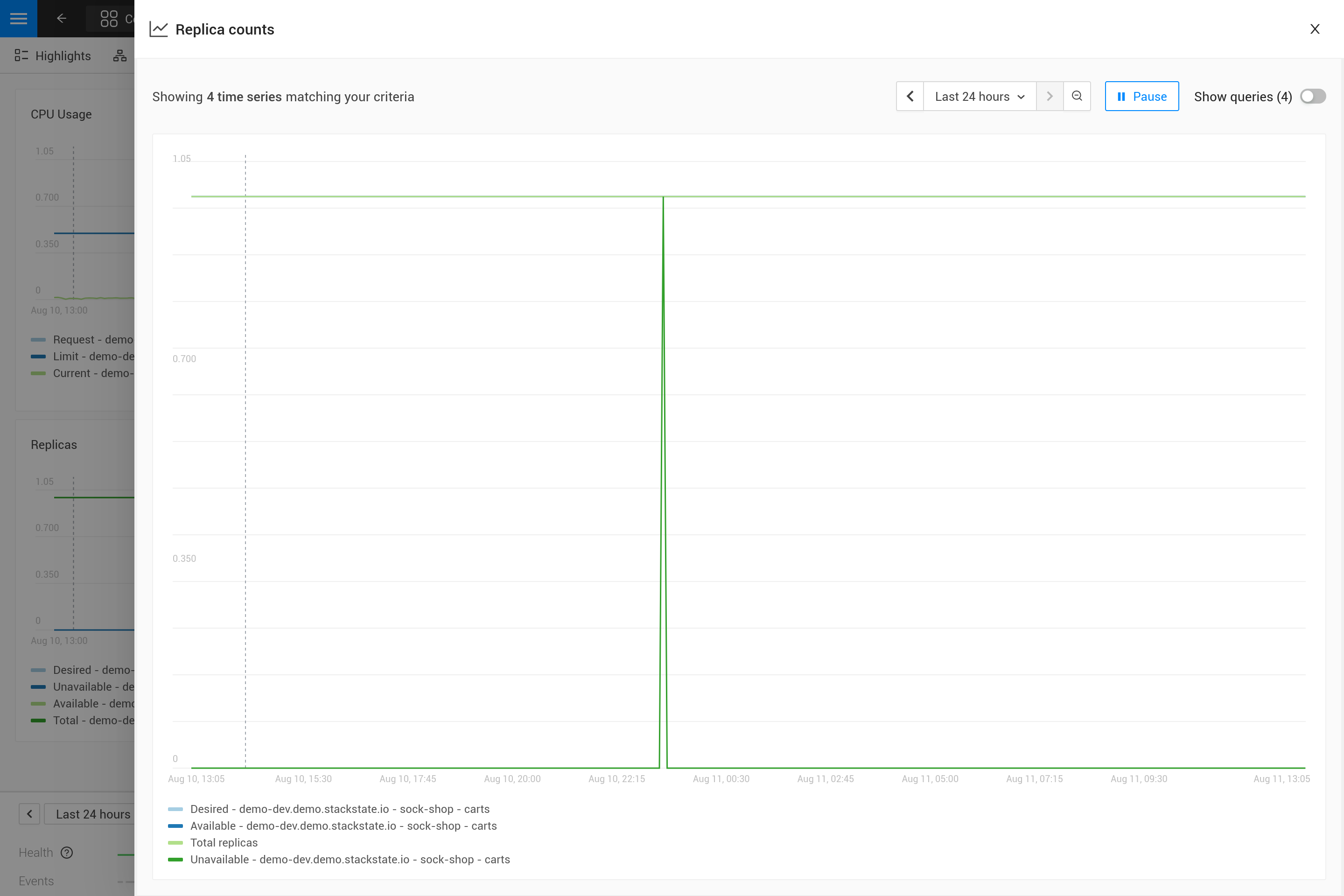
Using metric labels in aliases
When a single query returns multiple time series per component, this will show as multiple lines in the chart. But in the legend they will all use the same alias. To be able to see the difference between the different time series the alias can include references to the metric labels using the ${label} syntax. For example here is a metric binding for the "Container restarts" metric on a pod, note that a pod can have multiple containers:
If the multiple time series naturally correspond to other components in the system, it is possible to turn the entry in the legend into a link. For this, the componentIdentifierTemplate can be provided.
- metricId: my-pod-restart-count
  name: Container restarts
  queries:
  - alias: Restarts - ${container}
    componentIdentifierTemplate: urn:kubernetes:/${cluster_name}:${namespace}:pod/${pod_name}:container/${container}
    expression: max by (cluster_name, namespace, pod_name, container) (kubernetes_state_container_restarts{cluster_name="${tags['cluster-name']}", namespace="${tags['namespace']}", pod_name="${name}"})
  chart:
    _type: TimeSeriesChart
    unit: short
Note that the alias references the container label of the metric. Make sure the label is present on the query result, when the label is missing the ${container} will be rendered as literal text to help troubleshooting. Similarly, the componentIdentifierTemplate uses the other labels on the returned time series.