Component Presentation Schema
|
See it in the scaffold: the stackvista/stackpack-templates scaffold has a full, commented |
|
Status: Under active development. Availability: Behind the StackPacks 2.0 feature flag. This documentation describes the current design intent and high-level configuration surface. Note: no behavior and capabilities have been implemented yet. As this feature is under active development; behavior, schemas, and capabilities may change as the model evolves. |
Overview
This page documents the configuration schema used by the UI Presentation model. It is intended as a reference for authors defining UI presentation behavior.
All schemas described here are part of StackPacks 2.0 and are under active development.
UI pages populated by ComponentPresentation
See the following screenshots to get an idea of which pages and UI elements on the respective pages the ComponentPresentation configuration pertains to.
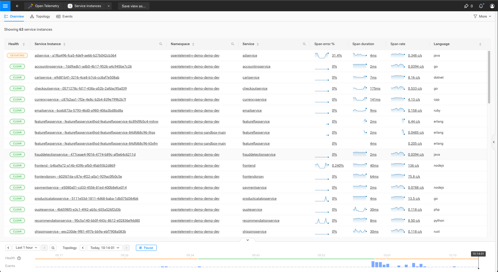
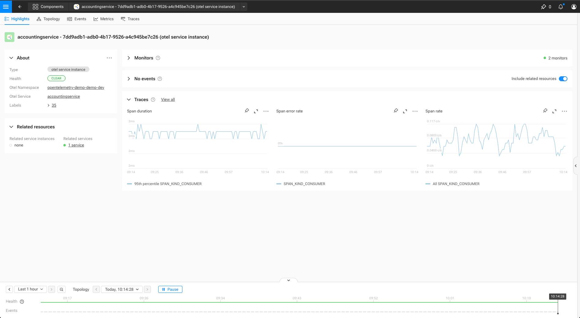
ComponentPresentation
A ComponentPresentation defines how matching components are presented in the UI
for a given mode and context.
type: ComponentPresentation
identifier: urn:...:component-presentation:<presentation-name>
name: string
description: string           # Optional description

binding:
  query: string               # Primitive STQL query that defines to which components does the presentation applies to

rank:
  specificity: number         # Higher values indicate more specific definitions

presentation:
  icon: !icon path            # Optional icon

  overview:                   # Optional overview page configuration
    name:                     # Naming configuration
      plural: string
      singular: string
      title: string

    mainMenu:                 # Optional main menu entry
      group: string           # Name of an existing MainMenuGroup
      order: number           # Order in the group - higher numbers come first
      icon: !icon path        # Optional reference to icon

    fixedColumns: number      # Optional number of columns that remain fixed when scrolling horizontally
    columns:
      - columnId: string      # identifier for the column, to be aligned with more specific/generic presentations
        title: string         # Optional
        projection:           # Optional Projection
          _type: string
          ...                 # Additional properties dependent on projection type

    sort:                     # Optional default sort order
      - columnId: string      # References a column defined in `columns`
        direction: string     # Optional - Ascending (default) or Descending

  highlight:                                      # Optional highlight page configuration
    title: string
    fields:
      - fieldId: string
        title: string
        description: string                       # Optional
        order: number                             # Order in the about section - higher numbers come first
        projection:                               # Optional Projection - when absent, a field defined in a more generic presentation is suppressed
          _type: string
          ...                                     # Additional properties dependent on projection type
    relatedResources:                             # Optional - related resources to display
      - resourceId: string                        # Stable identity key for merging
        title: string                             # Section heading in the UI
        order: number                             # Display order - higher numbers come first
        topologyQuery: string                     # Optional - STQL query template with ${CEL_EXPRESSION} placeholders
        presentationIdentifier: string            # Optional - references a ComponentPresentation by identifier
    links:                                        # Optional - navigation links to display
      - linkId: string                            # Stable identity key for merging
        title: string-template                    # Optional display title; supports ${CEL_EXPRESSION} placeholders. Defaults to linkId after merging.
        target: string-template                   # Optional relative or absolute URL; supports ${CEL_EXPRESSION} placeholders. Required after merging for an included link to resolve.
        tooltip: string-template                  # Optional tooltip; supports ${CEL_EXPRESSION} placeholders
        filter: cel:boolean                       # Optional visibility predicate
        openInNewTab: boolean                     # Optional - default false
        order: number                             # Optional display order - higher numbers come first
    provisioning:                                 # Optional section to specify how provisioning details are shown
      topologySourceSelector: cel:boolean          # Optional predicate to select the source component with provisioning details
      showConfiguration: boolean                  # Optional - should provisioning configuration be accessible
      showStatus: boolean                         # Optional - should provisioning status be accessible
    events:                                       # Optional section to configure events
      showEvents: boolean                         # Should events be shown
      relatedResourcesQuery: cel:string           # Optional - topology query for components to include
      excludeRelatedResourcesQuery: cel:string    # Optional - topology query for components to exclude of events
    metrics:
      - sectionId: string
        title: string
        order: double
        metrics:
          - metricId: string
            order: double
            ...

  summary:
    metrics:
      - metricId: string
        order: double
        ...

  metricPerspective:
    tabs:
      - tabId: string
        title: string
        order: double
        sections:
          - sectionId: string
            title: string
            order: double
            metrics:
              - metricId: string
                order: double
                ...

  tracesPerspective:                              # Optional - makes the Traces perspective available
    showTraces: boolean                           # Should the Traces perspective be shown
    spanFilter:                                   # Selects the spans shown in the perspective
      serviceName: [string-template]              # Optional - filter spans by service name
      spanName: [string-template]                 # Optional - filter spans by name
      attributes:                                 # Optional - filter spans by one or more attributes
        <attribute-key>: [string-template]
        __multi__: ["${<cel-map-expression>}"]    # Optional - expands a map into several attributes
      spanKind: [Client | Consumer | Internal | Producer | Server | Unspecified]  # Optional - filter spans by kind
      spanParentType: [External | Internal | Root]  # Optional - filter spans by parent type
      statusCode: [Error | Ok | Unset]            # Optional - filter spans by status code
      durationFromNanos: integer                  # Optional - spans with duration >= value
      durationToNanos: integer                    # Optional - spans with duration < value
      scopeName: [string-template]                # Optional - filter by instrumentation scope name
      scopeVersion: [string-template]             # Optional - filter by instrumentation scope version

  filters:                    # Optional overview filters
    - filterId: string
      displayName:            # Optional - name in the menu
        singular: string
        plural: string
      menuSection: string     # Optional - section for the menu item
      filter:                 # Optional Filter
        _type: string
        ...

  metrics:
    - metricId: string
      name: string
      description?: string
      metricQueries:
        - expression: string                # promql query
          alias: string                     # name in legend
          componentIdentifierTemplate?: string    # URN template for linking
          primary?: boolean                 # is this query the primary one
      chart?:
        _type: 'TimeSeriesChart' | 'BarChart' | 'GaugeChart' | 'StatChart'
        unit?: string
        decimals?: integer
        ...                                 # depends on chart type
Identifier
Identifiers should follow the SUSE® Observability identifier (i.e., urn:…:<type>:<name>) format. Refer to identifiers documentation for more information.
Binding
The binding determines which components a ComponentPresentation applies to. Bindings are evaluated against component data and must be simple and efficient, as they are used during UI evaluation.
Currently supported binding type:
-
ComponentPresentationQueryBinding: a simple STQL query (refer to the STQL for more information). All field-based selectors (labels, layer, domain, identifiers, health state and name) are available, as is boolean logic to combine them. Only graph traversal (withNeighborsOf) is not allowed.
For overview pages, the set of ComponentPresentations that can contribute columns is determined on a query level. When there is a logical possibility for a component to match the overview query, but not the query for a particular ComponentPresentation, that presentation will not be considered.
Rank
The rank section controls how multiple matching ComponentPresentation definitions are combined.
It reflects how far down the resource hierarchy a presentation applies: from global/shared context to highly specific workload instances. Higher specificity values indicate more specialized definitions and take precedence over lower values when composing presentation behavior.
Values are user-defined but should generally increase as bindings become more specific along the resource hierarchy; the ranges below are guidelines, not enforced rules.
| Range | Use |
|---|---|
0 |
Universal base ( |
1–99 |
Environment & infrastructure (cloud, account, cluster) |
100–199 |
Platform & orchestration (k8s, otel base) |
200–299 |
Application / service |
300–399 |
Runtime / SDK / language |
400+ |
User / customer overrides |
Presentation sections
All fields under presentation are optional. A ComponentPresentation may define only a subset of presentation aspects.
Presentation sections are composed when multiple definitions apply to the same component.
Icon and name
Defines iconography and naming used across the UI. Icons can be included by using the !icon yaml tag, followed by the path of an icon relative to the icons/ folder.
E.g. !icon services/main-menu.svg can be used when the stackpack includes the file icons/services/main-menu.svg.
Traces perspective
The tracesPerspective section makes the Traces perspective available on the highlight page of matching components.
spanFilter selects which spans appear in the perspective. String-valued fields are string templates: text is taken literally, and any $\{…} placeholder is evaluated as a CEL expression against the component, using the same context as metric queries.
serviceName: ["orderService"]                          # literal value
spanName: ["${name}"]                                  # the component name
attributes:
  service.namespace: ["${tags.singleValue('service.namespace')}"]
http.route: ["/api/${tags.singleValue('version')}"] # literal text and a placeholder combined|
|
The special attribute key multi expands one CEL map expression into several span attributes at once, which is useful when the attribute keys are not known ahead of time. Its value must be a single $\{…} placeholder that evaluates to a map<string, string>; each entry of the map becomes one span attribute. Use selectPrefix to turn a set of related tags into attributes:
attributes:
  __multi__: ["${selectPrefix(tags, 'otel.')}"]   # tags otel.service, otel.version -> attributes service, version
Because attribute keys must be unique, add a numeric suffix (multi1, multi2, and so on) when you need more than one such expansion in the same spanFilter. This is the same multi expansion used in metric queries, where the expansion is written as a plain multi label matcher with no suffix because PromQL matchers are a list rather than a map.
spanKind, spanParentType, statusCode and the two duration bounds are literal values and are not evaluated as expressions.
Resolution is best effort: a field whose expression fails to parse or evaluate is dropped from the filter and logged, while the remaining fields still apply.
When several ComponentPresentation definitions match a component, the whole tracesPerspective section is taken from the most specific one — it is not merged field by field. Set showTraces: false on a more specific presentation to suppress a Traces perspective that a less specific one enabled.
A TraceBinding setting matching the same component takes precedence over the tracesPerspective section.